
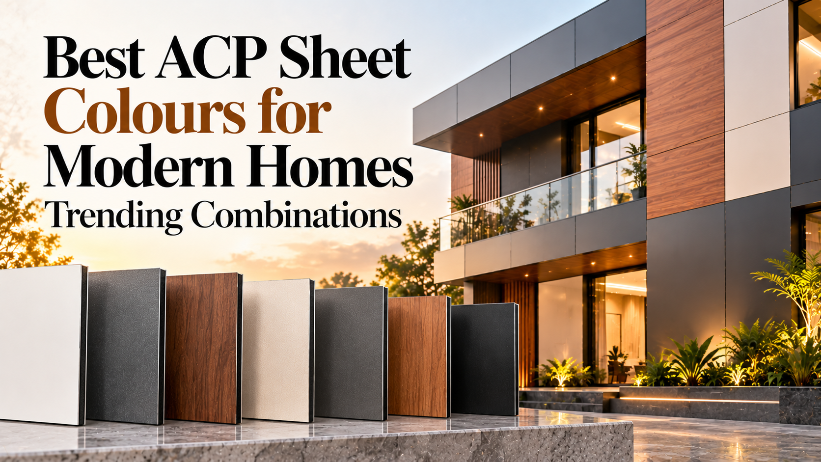
The exterior of a home sets the tone for its entire architectural identity. In modern residential design, homeowners and architects are moving beyond conventional paint combinations and exploring ACP sheet colours to create façades that look distinctive, premium, and contemporary.
Aluminium Composite Panels offer a wide range of colours, textures, and finishes, allowing different shades to be combined with wood, stone, metallic, and other architectural surfaces. Current design guidance shows strong interest in neutral bases paired with darker or warmer accent colours, while earthy tones and wood-inspired finishes continue to feature prominently in modern elevations.
Whether you are planning a villa, bungalow, duplex, apartment elevation, or a contemporary independent home, the right ACP sheet colour combination can add depth and character to the façade.
Here are 15 combinations worth considering for modern homes in 2026.
Best 15 ACP Sheet Colours Combinations for Modern Homes
1. Charcoal Grey and Teak Wood
Charcoal grey creates a sophisticated architectural base, while teak wood introduces natural warmth. This combination works particularly well when wood-finish ACP is used around balconies, windows, or entrance areas.
Best for: Modern villas, duplexes, and luxury homes.
2. White and Walnut Brown
White keeps the elevation bright and clean, while walnut brown adds richness and contrast. It is a versatile combination that works across minimalist and contemporary architectural styles.
Best for: Independent houses and modern bungalows.
3. Matte Black and Warm Beige
Matte black provides a bold, contemporary accent, while beige prevents the exterior from appearing too dark. Using black selectively around windows or architectural projections can create a refined appearance.
Best for: Urban homes and contemporary elevations.
4. Ivory and Stone Grey
Ivory paired with stone grey creates a softer, understated façade. The combination works particularly well with natural landscaping, wooden doors, and large windows.
Best for: Elegant villas and spacious residential properties.
5. Concrete Grey and Oak Wood
Concrete-inspired grey gives the home an architectural, industrial character, while oak wood introduces warmth. The contrast between the two surfaces creates visual depth without using too many colours.
Best for: Minimalist and industrial-style homes.
6. Navy Blue and Off-White
Navy blue can create a distinctive exterior when balanced with off-white panels. The lighter shade helps maintain brightness while the blue provides a strong focal accent.
Best for: Contemporary villas and duplex homes.
7. Coffee Brown and Cream
Coffee brown and cream create a warm residential palette. This combination works especially well with warm outdoor lighting and natural stone or wooden elements.
Best for: Traditional-modern and luxury residential designs.
8. Charcoal Grey and Silver Metallic
For a more contemporary appearance, pair charcoal grey with silver metallic ACP. The darker shade provides depth while metallic panels introduce subtle reflection and sophistication.
Best for: Modern urban houses and designer façades.
9. Sand Beige and Walnut
Sand beige provides a soft natural base, while walnut panels can be used as vertical or horizontal highlights. This pairing creates a calm, premium appearance.
Best for: Large homes, villas, and resort-inspired residences.
10. White and Champagne Metallic
White combined with champagne metallic creates a luxurious but understated façade. Champagne accents can be used around balconies, entrance features, or selected architectural bands.
Best for: Premium modern residences.
11. Olive Green and Sand
Nature-inspired colour palettes are becoming increasingly popular in residential architecture. Olive green paired with sand creates an earthy appearance that works particularly well alongside gardens and natural landscapes.
Best for: Garden homes and nature-inspired architecture.
12. Terracotta and Off-White
Terracotta introduces warmth and personality, while off-white balances the stronger colour. This is particularly effective when terracotta is used as an accent rather than across the entire facade.
Best for: Contemporary homes with traditional design influences.
13. Black and Natural Stone
Black ACP paired with a stone-inspired finish creates a dramatic and premium elevation. The combination can highlight specific architectural portions without overwhelming the façade.
Best for: Luxury villas and modern residences.
14. Soft Grey and Golden Oak
Soft grey creates a neutral foundation, while golden oak adds warmth and texture. This combination is especially effective for homes featuring large glass windows and clean geometric lines.
Best for: Contemporary family homes and duplexes.
15. Marble White and Matte Charcoal
Marble-inspired white offers a luxurious visual character, while matte charcoal provides a strong contrast. It can be used around entrances, columns, balconies, and other focal areas.
Best for: High-end modern home elevations.
Quick Comparison of the 15 ACP Colour Combinations
| Combination | Design Character |
| Charcoal Grey + Teak | Warm & Contemporary |
| White + Walnut | Clean & Elegant |
| Matte Black + Beige | Bold & Sophisticated |
| Ivory + Stone Grey | Soft & Timeless |
| Concrete Grey + Oak | Modern & Industrial |
| Navy + Off-White | Distinctive & Fresh |
| Coffee Brown + Cream | Warm & Classic |
| Charcoal + Silver | Sleek & Premium |
| Sand Beige + Walnut | Natural & Refined |
| White + Champagne | Luxury & Minimal |
| Olive Green + Sand | Earthy & Calm |
| Terracotta + Off-White | Warm & Artistic |
| Black + Stone | Dramatic & Premium |
| Soft Grey + Golden Oak | Contemporary & Warm |
| Marble White + Charcoal | Luxury & Modern |
How to Choose the Right ACP Sheet Colour Combination
Choosing colours randomly can make a façade look visually crowded. Instead, consider the building’s architecture, surrounding materials, lighting, and location.
Start With a Dominant Colour
Use a primary colour across the largest areas of the façade. Neutral shades such as white, beige, grey, and warm sand are versatile choices.
Add a Secondary Colour
Use a darker or contrasting colour on selected architectural elements such as balconies, window frames, entrance projections, or vertical strips.
Use Wood as an Accent
Wooden ACP finishes can add warmth to otherwise neutral elevations. Rather than covering the entire building, use wood textures strategically to create contrast.
Consider the Surroundings
The home’s landscape, boundary wall, flooring, windows, and doors should work with the ACP colour palette rather than compete with it.
Think About Maintenance
Lighter shades generally make dust less visually prominent, while reflective or glossy surfaces may require more frequent cleaning to retain their appearance.
Which ACP Colours Are Trending in 2026?
Current design discussions point towards a preference for light neutral bases combined with charcoal, black, warm browns, earthy shades, and wood-inspired accents. Nature-inspired colours and restrained contrast are also increasingly being used to create contemporary yet timeless façades.
The popularity of wood, stone, metallic, glossy, and textured ACP finishes also gives homeowners more choices than simply selecting a solid colour.
Should You Choose Glossy or Matte ACP Colours?
The finish is just as important as the colour.
Glossy ACP: Works well for homeowners looking for a brighter and more reflective appearance.
Matte ACP: Offers a more understated and contemporary aesthetic and can work particularly well in minimalist designs.
Wood finish: Adds natural character and warmth.
Metallic finish: Creates a sophisticated architectural effect and works well as an accent.
The right choice depends on the façade style and the amount of contrast you want to create.
Why Pioneer Panels for Modern Home Exteriors?
Pioneer Panels offers a diverse range of ACP finishes that can be used to create modern residential elevations, from Wood and Colours Series to Earth, Metal, and Innovation Series. The collection includes wood-inspired surfaces, solid and metallic colours, natural textures, stone-inspired finishes, and premium architectural effects.
This gives architects, designers, and homeowners the flexibility to build a coordinated palette instead of limiting the exterior to conventional paint colours. Pioneer Panels also manufactures ACP solutions designed for modern architectural applications, helping combine visual appeal with practical performance.
Conclusion
The right ACP sheet colour combination can completely change the appearance of a home’s exterior. From classic white and walnut to bold charcoal and teak or contemporary concrete grey and oak, the best combinations create contrast without compromising visual balance.
For 2026, the strongest residential trends are moving towards neutral foundations, natural wood tones, earthy colours, dark accents, and carefully selected metallic finishes.
Before finalizing your design, review physical samples under natural daylight and consider how the colours interact with windows, doors, lighting, landscaping, and surrounding buildings.
Frequently Asked Questions
1. Which ACP sheet colour is best for a modern home?
Charcoal grey, white, beige, walnut, teak, and muted earthy shades are versatile choices for modern home exteriors. The best option depends on the architectural style and surrounding materials.
2. What are the most popular ACP colour combinations for home elevations?
Combinations such as charcoal grey and teak, white and walnut, concrete grey and oak, and black with stone-inspired finishes are popular choices for contemporary elevations.
3. Are dark ACP colours suitable for exterior walls?
Yes. Dark ACP colours can create a striking modern façade, particularly when paired with lighter colours or wood finishes. The selected panel should be appropriate for exterior conditions.
4. Which ACP finish is best for home exteriors?
PVDF-coated exterior-grade ACP is commonly preferred where long-term UV and weather performance is required. The finish—matte, metallic, wood, or glossy—can then be selected according to the design.
5. Can wooden ACP be combined with solid-colour ACP?
Yes. Combining wood-finish ACP with solid colours such as charcoal, white, grey, or beige is an effective way to create depth and visual contrast in a home elevation.
6. How many colours should I use on a house elevation?
Using two or three coordinated colours is generally easier to balance than using many contrasting shades. A dominant colour, secondary shade, and occasional accent can create a cohesive elevation.
7. Do ACP sheet colours fade over time?
Colour retention depends on the coating system, product quality, exposure, and installation. Exterior projects should use panels and coatings specifically designed for outdoor conditions.
8. How do I select an ACP colour for a small house?
For smaller homes, lighter base colours such as white, ivory, beige, and light grey can help create a more open appearance. Darker shades can then be used as accents.